The use of mobile apps in all regions of the world is increasingly growing. But several ventures for mobile app creation also fail.
Why is it? It’s because the developers are not clear with the fundamentals of how to design an app.
Such a thing requires in-depth study coupled with picking up and implementing the right tools and resources.
The massive popularity of mobile apps has created tremendous market competition.
However, if you spend enough time creating your app for success, joining the mobile world can prove rewarding.
An appealing design impacts tremendously on the go. Therefore, an app should carry an intuitive design and make users come for more.
The goal is to increase app stickiness and provide end-users with an enjoyable experience. Ultimately, when creating a mobile app design template, it is essential to keep in mind the app’s purpose and who the target users are.
App design separates you from the competition and can act as the main difference between the production of an average product and an outstanding one.
Some of the most significant characteristics of a mobile app are fast navigation and beautiful interfaces.
The differentiation between a good app and a poor app is usually its make – User Interface (UI) and how users use it – (UX).
Mobile users demand a lot from an app today: quick loading time, ease of use and interaction delight.
You have to consider UX to be a slight element of design and an integral component of product strategy if you want your app to be successful.
There are several things to consider when developing mobile devices. A lot of practical suggestions that you can add to your design are outlined in this article.
- Know the purpose of making an application
- Choosing the right design tools
- Checking platform guidelines
- Wireframing and app flow
- Decluttering wireframes
- Segregating designing tasks
- UI Design
- App Design
- Design Feedback
- Moving to Development
Establish your application’s purpose and goal
Identifying the mobile app development goal is crucial. A lot depends on it. It is right from discovering how much it costs to design an app to the target audience for marketing an app.
Why, in the first place, are you creating an app?
This is just one of the few questions that you can ask yourself and the rest can follow:
- What is the underlying objective of your mobile app?
- What do you want users to do with it?
- How do you go about appealing to users with your app?
- What are the user problems your application address?
- Why will consumers choose your software over your competitors’ apps?
- How does it set itself apart from your app?
Establishing and writing down simple expectations for your app will give you a valuable reference point that you will return to during the entire process of developing your app.
If one of the answers also becomes elusive, it will help you keep your team on the right track and improve your app’s chances of dominating the market by getting it all jotted down.
The next step is to pick the right app design software to get the job done.
A lot will depend on the platform you are designing your application for.
The designers need to know how to design an app for iPhone if it is for iOS designing.
Also, when it comes to developing mobile applications from scratch, the good news is that you can usually use the same resources for both, regardless of the platform.
Adobe Photoshop, Adobe XD, and Sketch are common choices for mobile app designers.
There are many more, but in the business, these are the big names.
You may think Photoshop is your best choice for mobile app design, particularly if you’ve used it for other kinds of design work, but you’re better off with Adobe XD or Sketch when it comes to designing mobile apps.
That said, Sketch is considered the de facto norm here, although Adobe XD, having recently added design systems, is putting in some heavy competition.
One of the key reasons for using Adobe XD or Sketch for anything like Photoshop is that the two tools are planned and prototyped.
They help you simplify the workflows and target user interface and UX designers, though Photoshop is more appropriate for image handling.
One important note here: If you intend to build or support cross-platforms, Adobe XD is the apparent winner since Sketch is only available on macOS.
Checking OS design guidelines
Wondering how to design an app for Android?
Well, Google Play Store has clear-cut guidelines on things you should consider. You will first need to grasp your platform’s dos and don’ts before you begin designing, especially with iOS, as Apple is quite stringent about what goes in their App Store.
Generally speaking, the design of mobile apps shares many similarities between various operating systems as they all follow the below-mentioned guidelines:
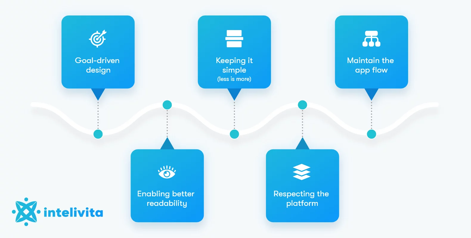
- Goal-driven design
- Keeping it simple (less is more)
- Maintain the app flow
- Enabling better readability
- Respecting the platform
While you know how to design an app, the part of ‘respecting the store guidelines’ will certainly define your design scope.
The app store expects an app to behave familiarly and intuitively when users download and install an app on their smartphone.
Do you want us to build a mobile app for you?
Let’s Discuss Your Project
Connect Now
They base their decisions on what they know, so users are likely to uninstall it when an app goes against 90% of the OS-specific design guidelines.
The numerous navigation patterns that iOS and Android have not only need to be considered, but you also need to think about buttons, font selection, and UI object placement, all of which differ with each platform.
Depending on how you plan your users to navigate within the app, the following is highly useful:
1. Interactive Stateful Elements : A seamless app UX will be free from chaos and redundancy.
The app designers who know how to design an app must blend in the interactive elements while negating redundant artboards to improve user stickiness and higher app retention.
2. Code Components : The design source should come from a fundamental truth of the application’s core.
The production code must carry interactive elements coupled with the prototype and keep all the elements functional best.
3. Conditional Interactions, Variables, Expressions : It is always a great idea to stick to the real and coded apps.
Designers can also begin with adding prototype layers to store and manipulate user interactions within the app.
How Much Does It Cost to Make an App?
Read More
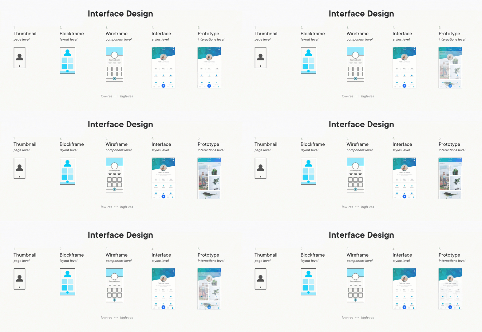
Designing the app wireframes flow
A lot of the answers to how to design the best mobile app will boil down to working on the app flow control and layout before designing an app’s look and feel.
This is why it pays off to create a mobile app design template where the wireframing comes to play.
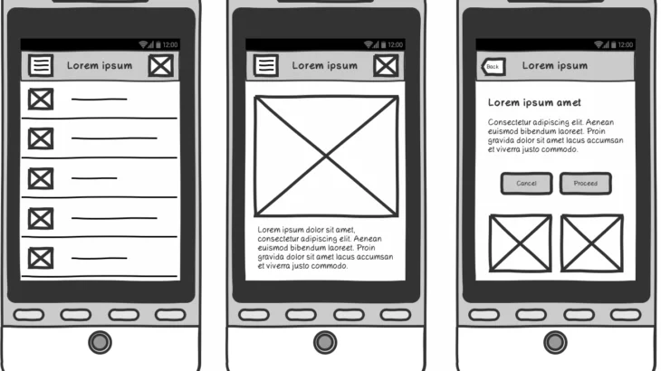
Wireframes allow you to understand how an interface would be browsed and used by consumers.
In their architecture, they’re usually simplified so that the emphasis is on flow and usability.
Source: uxdesign.cc
Although there are several dedicated wireframe resources, using a pen and paper is not unusual for designers.
However, if you’re looking for something a little more hi-tech and collaborative (which is particularly important when collaborating with a remote team), consider developing your wireframes in Sketch or Adobe XD.
The advantage of using this wireframing software is that you can relatively quickly convert your low-fidelity wireframes into high-fidelity previews while collaborating remotely.
Decluttering
One of the big tips in designing the best mobile applications is to strip out the clutter.
Clutter is one of good design’s worst enemies. You confuse users with so much information by cluttering the interface: Every button, picture, and icon added makes the screen more complicated.
Look for something that needs user effort in the app design – right from entering data to making critical design calls.
Always check for alternatives and choose the best option by segregating the tasks.
For instance, in some situations, instead of asking the user to type more, you can reuse previously entered data or use already available data to plan a smart default.
For those looking to answer the complex question of designing the best app for iPhone, it is simple – declutter your app. Clutter is terrible on the desktop, but on the smartphone, it’s much worse (just because we don’t have as much real estate for mobile devices as we do on desktops and laptops).
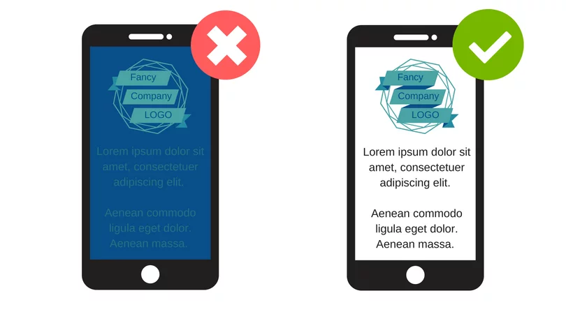
It is important to get rid of all that is not completely necessary in a mobile design because it will boost understanding by reducing clutter.
The functional minimalism technique will help you deal with the issue of a cluttered UI. You can follow these two quick tips to ensure best app design-
- Retaining minimum material by offering the user with only the stuff they are familiar with.
- Minimizing the UI components by keeping a simple design to keep end-users satisfied and happy using the app.

Left: What you should not give | Right: What interface should an app have
Break tasks into bite-sized chunks
It is easier to divide such tasks into several subtasks if a task involves many steps and actions needed from the user’s side.
In mobile design, this concept is extremely relevant because you don’t want to build too much confusion at one time for the consumer.
A great example is a leap checkout flow in an e-commerce app, where a complex checkout task is broken down into bite-sized chunks by the designer, each requiring user action.
Two distinct behaviors can also be related to chunking – browsing and purchasing.
The user can continue through it more smoothly when a flow is viewed as a series of steps logically associated with each other.
The Application UI Design
Do not equate UX prototype and prototyping with the construction of the UI.
When designers are on a hunt and looking for an answer to designing an app, the most obvious pick would be UX testing, wireframing and prototyping.
All these define how the software functions while the user interface is designing how the app looks.
Source: pyramidions.com
If the UX is tested and modified with multiple prototypes tested and finished, you must step into the user interface design phase.
At this stage, you have to visually view ideas, color schemes, fonts, shapes, buttons, font sizes, pictures, shapes, illustrations, animation, etc.
Designing a mobile application for iPhone and Android will need you to test various prototypes to see what works best for your users.
It is better to tweak the color schemes, skins and themes and other visual elements To see what works best.
It is a bit similar to A / B checking, but it is different that you have to make the decisions yourself in the case of UI design albeit, without onboarding the customers.
Mobile app designing
It is time to think about your app’s actual design and build stunning, practical mockups.
This is a super important move because it’s what will leave your customers with a lasting impression, so when it comes to your app design so better not hurry or skimp.
If you do not know how to design an app, do not worry – make sure you follow the below-mentioned tips to drive app success.
What colors, fonts and design elements you can use is a significant decision, so in the design tips section below, we’ll talk more about this.
You have many different choices when it comes to choosing how to get your app built. You might consider creating your app, but we wouldn’t suggest it unless you’re a graphic designer.
It’s easier to rely on a specialist to make sure you’re going to get a great result.
1. Design a good onboarding experience
The delivery of an outstanding onboarding experience is the basis for maintaining users’ sense of the mobile UX.
The purpose of onboarding is to illustrate the value your app offers.
Among the many onboarding techniques, one is incredibly efficient: contextual onboarding.
Contextual onboarding in mobile app design implies that instructions are only given when required by the user.
An excellent example is FormAssist.
This app combines immersive workout plans with an advisable healthy routine to show users how the app functions.
This application can also track daily user activities while enabling users to interact with each element within the app.
An empty state is another thing that can be beneficial when onboarding. An empty state is a screen that allows users to go through one or more steps to fill it with data and whose default state is empty.
An empty state may also teach people how to use an app and remind the user about what content to expect on the website.
The guidance will inform users that they are doing the right thing, even if the onboarding process consists of only one stage.
2. Ensuring design consistency
Consistency is a basic design concept as it reduces doubt. Maintaining a consistent overall appearance in an app is critical as it ensures seamless user-flow concerning a mobile app.
Source: uxcam.com
Here are some of the ways how you can bring inconsistency in a mobile app design:
- Visual Consistency: Typefaces, buttons and labels must be consistent in the app for visual integrity.
- Functional consistency: In all sections of your software, interactive elements should function similarly.
- External consistency: The design of several items should be consistent. This way, when using another product, the user may apply prior knowledge.
Here are a few practical recommendations on how to make a design consistent:
Do not imitate elements of UIs from other platforms. Don’t bring UI elements from other platforms when designing a mobile app for iOS or Android.
There should be a native feel to icons, functional elements (input fields, checkboxes, switches) and typefaces.
As much as possible, use native components so that people trust your app.
Keeping the phone app design compatible with the website. An instance of external continuity is this.
Ensure that all of them share similar characteristics if you have a web service and a smartphone app.
This will allow users to make changes between the mobile app and the mobile web without any hassle.
App design consistency elements as mentioned above, must be followed to avoid confusing the users.
1. Setting up the Typography
Readability and legibility are the secrets to mobile typography when answering how to design an app.
There’s no point in delivering content in the first place if people can’t read the content.
Second, a few realistic legibility recommendations:
- Font Size: Normally, it isn’t easy to read something less than 16 pixels (or 11 points) on any page.
- Font Family: Most users prefer a simple, easy-to-read font.
A safe bet is the default typeface of the system (Apple iOS uses the San Francisco font; Google Android uses Roboto).
- Light-colored text (such as light grey) can look aesthetically pleasing, but it will be difficult for users to read it, particularly against a light background. For easy readability, make sure there is plenty of contrast between the font and the context.
Contrast ratio recommendations for images and text are provided by the WC3’s web content usability guidelines.
2. Mobile app design recommendations for readability:
Avoid using all caps: In cases that don’t require careful reading (such as acronyms and logos), all caps text, meaning text with all letters CAPITALIZED, is no big deal but avoid it when your message needs heavy reading.
Limit text lines to their length: For mobile devices, a reasonable rule of thumb is to use 15 to 25 characters per line.
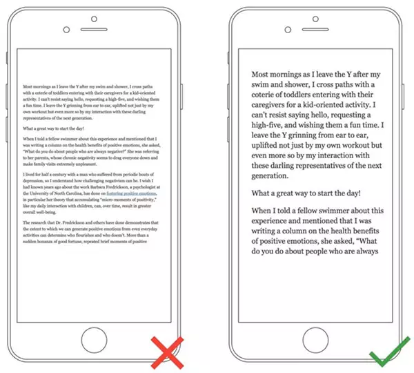
Left: Avoid crowded text lines | Right: Follow spaced out text display
Get the mobile app design feedback
When you have near-perfect renderings, it’s time to call in your friends, family, and even distant relatives and test your app’s architecture.
This will be made simple by a rendered click-through model, which will give the testers a real sense of what the app will be like.
It is important to remember that this is not your finished app.
A crucial step in mobile app design is to test it amongst the probable users and get feedback from any novice user.
Evaluate the app design based on its layout, navigation, look and feel test.
The more people you sample your app design, the higher your reviews and a better understanding of what works and needs improvement.
Push your friends towards providing constructive criticism.
When it comes to designing the best mobile app for iOS or Android, never be hesitant to dig deeper with your samplers and find out exactly what they believe.
Is it too cluttered? Does it take too much time loading?
Is it difficult to navigate back and forth?
Do note any suggestions your testers may have.
If you’ve got a rendered click-through model, have a look over the shoulder of your samplers as this reflects how they navigate your app, giving you the end-users’ point of view.
Move to development
Now it’s time for your mobile app developer or development team to hand your concept over.
They can code the app’s usable side to make sure it is doing what it is supposed to do.
The app developers are most likely going back and forth with you and your designer to change the design run better and to sort out any challenges they encounter during the process.
After multiple re-runs and tests, your working application will be ready.
The mobile app design will also have some updates with time, but post-development and testing will be in a ship-to-market phase.
Let’s discuss your app design requirements and get started with a team of experienced designers at Intelivita
Contact Us Now
Let Intelivita Help You Get Started with Your Mobile App Design
While it is obvious for businesses to consider the cost of mobile app design, remember, hiring a team of experienced designers helps.
You can choose to hire app designers in the USA, but that may cost a dime.
Instead, you can rely on hiring app designers for iOS and Android to get things to deliver.
Choosing a dedicated team of app designers would mean considering the following:
- Their current availability for the project
- Collective experience
- Portfolio of app design work carried out so far
- How much does it cost to design an iOS and Android application?
- What is the turnaround time?
Once you have answers to these questions, start with the app design. We at Intelivita are providing app designers for all your requirements.
You can opt for hiring dedicated app designers or give us the entire project on a turnkey basis.
