There are certain eCommerce website features to keep on your priority list when setting up an online store.
Without these features, your website could become just a fancy artwork rather than a money-making machine.
You definitely wouldn’t want that.
And trust us, a stunning logo isn’t really one of them. Yes, a nice logo is, well, nice. But it’s secondary.
With that caveat out of the way, let’s now dive in and see some of the important e-commerce features every sales-drive online store needs to have.
Ready to build a feature-rich eCommerce website for your online business? Schedule a FREE call with our expert eCommerce Consulting team and let us help you create a winning eCommerce strategy!
11 Features of E-commerce Websites to Keep In Mind
1. Responsiveness
First on this e-commerce website features list is responsiveness.
A site is said to be responsive if it flows well on large screens like a desktop computer, laptop, or tablet, and also excellently well on smaller screens like mobile phones.
Now, you may be wondering why we chose to put it first here.
Well, the reason is that responsiveness is one of the key metrics Google, and other search engines, use for ranking a site.
So, you can be sure that most people visiting your do so from their mobile phones.
If your website isn’t responsive enough, you might lose them for good – and also their patronage.
Lucky for you, creating a responsive, mobile-friendly e-commerce website isn’t rocket science.
You just have to invest in quality website themes.
You will find lots of these themes on WooCommerce, Shopify, Magento, and any other e-commerce framework you might be using.
Better yet, if you have the budget, hire an eCommerce development company. It will cost you money well alright, but then you will enjoy unlimited customization.
2. Good Design
How well-designed is your website? Are your web pages at best clunky and unappealing?
The thing is, no matter how awesome and powerful your e-commerce site is, it won’t convert as you would expect if it is poorly designed.
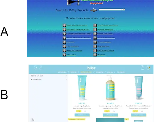
Have a look at these two website. Which do you think will convert better?
B, right?
While they are both eCommerce websites, their user experience is worlds apart.
While A has a horrible mix of colors, a poor layout, and an odd choice of font, B is visually appealing and easier to use.
If you noticed, B has just two colors and a ridiculously simple layout.
This goes to show you don’t have to do anything complicated to make your website look good with an awesome user experience.
As a rule, keep things simple. If possible, use just two fonts, two colors, lots of whitespaces, etc.
If you must use more, do so with caution.
And as you might have guessed, all you need to do to make your website shine and stand out is by using a quality website theme.
You don’t have to write any code.
3. Fast Loading Speed
Good load speed is another essential of e-commerce you can’t afford to miss.
Care to know why? People are impatient.
Studies suggest that if your website takes more than 2 seconds to load, visitors will start to leave your site.
And for every other second it takes to load, your conversion rate drops by 4%.
To put it in a simpler perspective, the longer your e-commerce website takes to load, the lower it will convert.
And you know, less conversion connotes less sales.
On top of that, Google hates websites that take too long to load.
If yours does, it will rank lower on Search Engine Result Pages (SERPs).
How then can you make your website load faster?
Firstly, you have to optimize your images.
More often than not, heavy images are the #1 culprit of a slow-loading website.
This is because they exert a lot of weight on web servers and take more time to render.
Chances are you have a ton of images on your site and optimizing them manually will take forever. Well, you don’t have to.
You just need to find the right optimizer app/plugin for your website capable of handling image optimization automatically.
Secondly, you need to use fewer plugins/apps.
Only use the essentials. Also, try hosting your website on a CDN (Content Delivery Network). Enabling browser caching will also help.
4. Easy Navigation
If you are serious about scaling your e-commerce business, you must make your website easy to navigate.
This means visitors should find it easy to move across your pages and post without cracking their heads about it.
Failure to do this can push them away from your website for good.
One surefire way to make your website easy to navigate is by using a well-detailed navigation menu.
Better yet, use a mega menu that contains links to all category and product pages on your site.
Be sure to add a detailed menu to your website footer as well. It will help.
5. Site Search
Not everyone will have the patience to move from page to page looking for a product. Most will rather just leave than go through that stress.
What to do: add a power search feature to your site. It should be powerful enough that it can give smart auto suggestions, just the same way Google and Amazon do.
It’s not enough to only add site search only on your homepage – it has to be present on all your pages, too.
In fact, it should have 100% visibility across your site. That is to say, searchers should find it easily no matter where they are on your site.
In addition, keep it simple. No need to use a fancy search bar.
Add visual cues, such as a magnifying icon to let users know it’s a search bar.
#6. Sorting and Filtering
Sorting and filtering are another essential features every successful eCommerce website must have.
Adding them to your site makes it easy for prospects to find specific products based on their budget and preferences.
Like the site search, sorting, and filtering features should be highly visible – and powerful too. By powerful, we mean they should sort and filter products quickly.
For starters, they should let prospects find products based on:
- Price
- Color
- Size
- New/old
- Reviews and ratings
Of course, you can always add more filter and sorting options.
7. Multiple Payment Option
Limiting your customers to only one or two payment options can have catastrophic repercussions.
If nothing else, you are surely going to lose a lot of sales. This is particularly true if you sell to customers in other countries.
Why is offering customers multiple payment options very important in e-commerce?
Firstly, there are certain payment options that aren’t available in certain countries.
Case in point: PayPal. So if you limit your payment option to only PayPal, for instance, you will cut off many potential customers.
Secondly, there are shoppers that will rather stick to their preferred payment choice than try a new one.
They will rather leave your site and go elsewhere than use a payment option they aren’t familiar with.
As such, it makes sense to give customers the option of paying via several methods.
8. Guest Checkout
Have you noticed you don’t necessarily need to have an account to shop on most online stores? This is because most sites now enable guest checkouts.
Enabling guest checkout on your eCommerce site improves customers’ shopping experience as they won’t have to create an account to buy products.
Another major benefit of enabling guest checkout is that it lets you capture impulsive buyers. What’s more, it can greatly reduce your website’s cart abandonment rate.
This is because forcing shoppers to sign in at checkout can vex them, causing them to abandon items in their carts.
9. Product Return Information
Ninth on our e-commerce website features list is product return information.
Why is this important? Not all sales will go well.
Sometimes, customers will want to return a purchase for a myriad of reasons.
It could be that they purchased the wrong product size.
Could also be they purchased a defective product or were shipped the wrong product.
Might also be they don’t want the product anymore.
Regardless of the reason, they need to know your return policy.
Can they return products for free? What is the minimum waiting period for returns? Can they exchange a product for another?
These are some of the questions you need to answer in your product return information.
#10. FAQ Page
Having product return information on your site is good. But it’s of little use if shoppers can’t find them.
This then begs the question: where do you display your product return policy? What better place than an FAQ page?
A FAQ page is a must-have for every e-commerce website.
And they aren’t only meant for displaying product return information, but for also answering potential questions customers might have.
For example, they might want to know if you offer discounts on bulk purchases.
They might also want to find out about your shipping times and offers.
If they can’t find answers to the question, most will leave.
The few patient ones would bombard your emails with questions, which isn’t a good thing.
So see to it that you have a detailed FAQ page on your website.
#11. Support Chat
FAQ pages are nice – but not everyone has the patience to go through them.
They will rather speak with someone than read.
As such, support chat is one of the vital eCommerce features that should miss from your website.
Not only will it smoothen your customers’ buying experience, but also build credibility for your business.


